
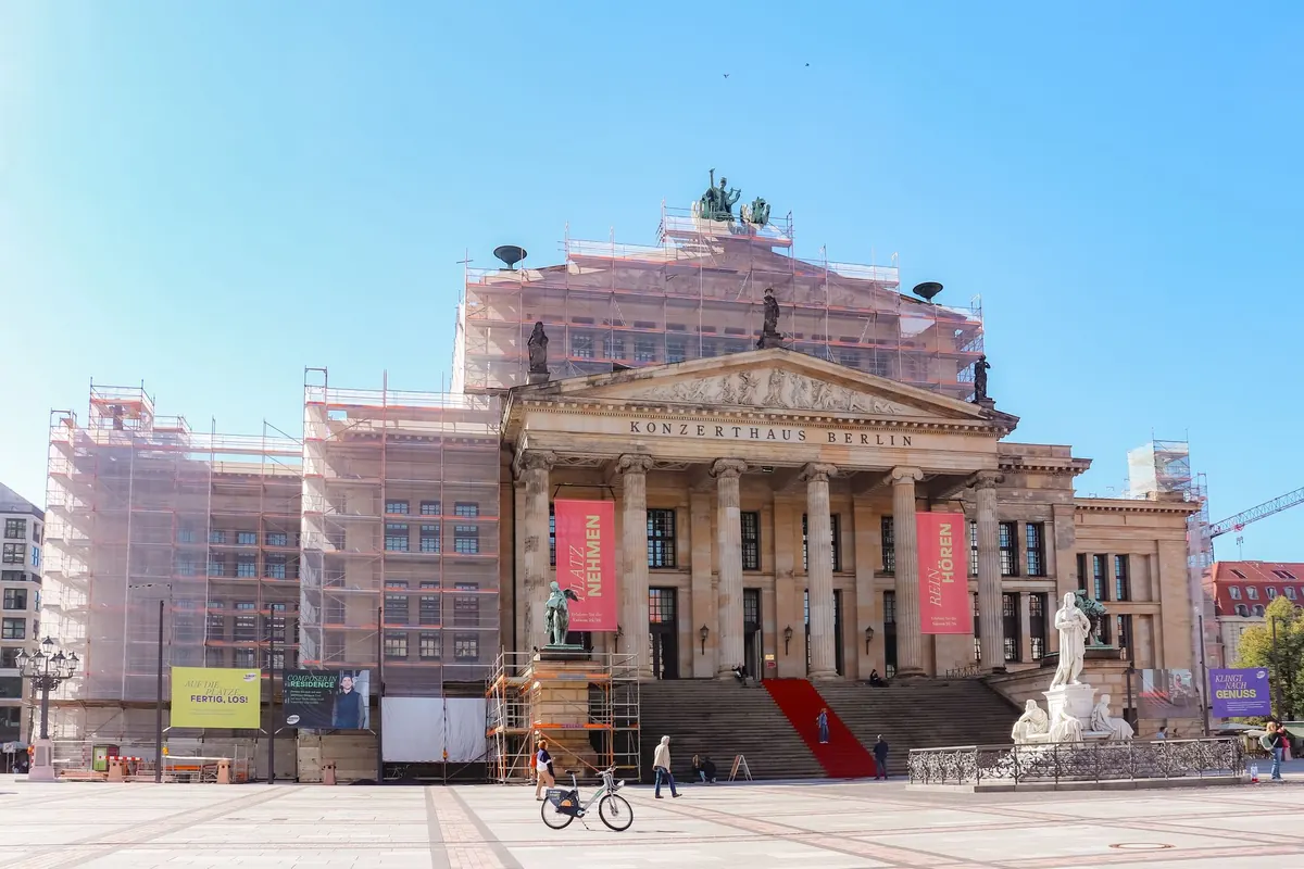
Most historic squares are not ruined by vandalism or by a shortage of money. They are damaged by well-funded, well-meaning projects that mistake a drawing for a place. A square is not a composition seen from above. It is a room the city uses every day — at seven in the morning and again at midnight, in August heat and February drizzle. The same handful of missteps turns up again and again, from small market towns to capital cities, and almost none of them are about style. They are about how the design reads the life that was already there.
Over-cleaning the facades
The impulse is understandable: the square should look its best for the reopening. Scaffolding goes up, every facade around the perimeter is blasted clean, repointed in one uniform mix and painted a single colour drawn from a print of how it might have looked two centuries ago. The result is a square that resembles a model of itself.
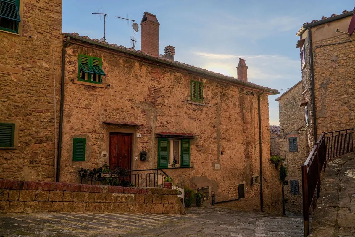
What disappears is patina, the record of weather and use; layers, which show that the square was built over generations rather than delivered in one delivery; and texture, which is what the eye actually reads at street level. A cleaned facade can look wonderful. A scrubbed one often looks thin.
Insist on test patches on a discreet corner, cleaned with the gentlest method that works, then left for a season to see how they weather. Ask whether the mortar and render are breathable — cement-rich repairs trap moisture and can push damp into the building. Keep the mismatched shutters and the old shopfronts. Preserve the faded painted signs. And budget to clean the stone again in ten years rather than pretending the job is final.
Designing for the aerial render, not the afternoon
Renders are made from thirty metres up, in June, with people placed like chess pieces and no bins, scooters, pigeons, scaffolding or rain. Decisions get taken on those images. A paving pattern that looks like clean geometry from above can be a slippery, joint-heavy puzzle at ankle height.
Walk the site at the hours it is actually used. Sit on the ground where a bench is proposed. Watch where water stands after a storm. Note where the shadow of the church falls at four in the afternoon in July, and where the sun hits at noon in January. Photograph at eye level, not from a drone.
A useful test for any scheme: can you describe how this square will feel on a wet Tuesday in November? If nobody on the design team can answer that, the design is not finished.
Removing the informal seating
This is the most frequent change, and often the most damaging. Steps get fenced. Low walls are capped with a slope or studs. Planters are cleared away because they collect litter and "obstruct circulation". Old benches are swapped for narrow seats with armrests, spaced so that nobody can lie down.
The square becomes tidy, legible and empty.
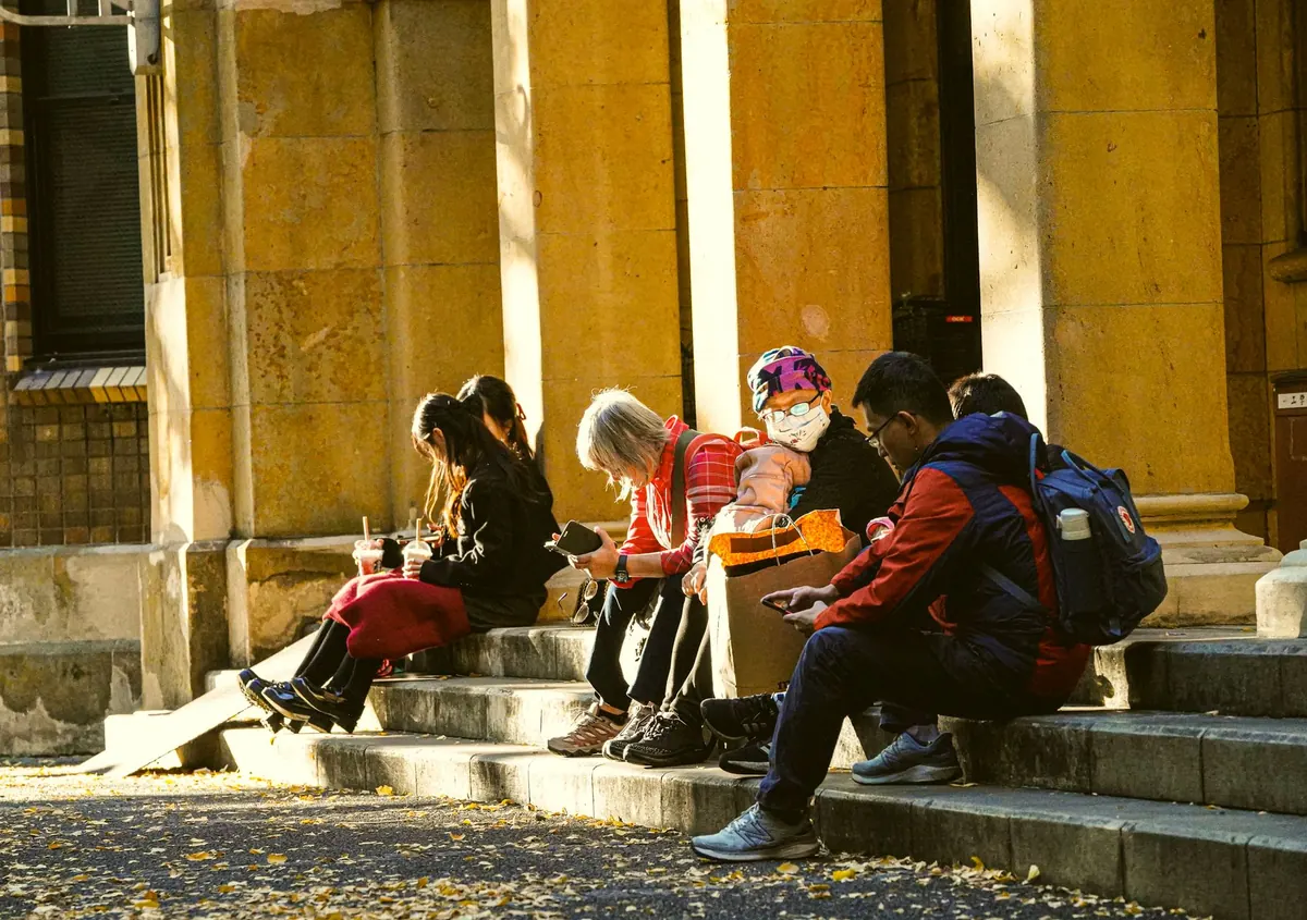
People sit on edges, ledges, steps, walls and each other. A wall at roughly seat height — around 42 to 45 centimetres — does more for a square than a designed seating zone with three benches in one corner, because it lets people choose: sun or shade, alone or in a group, facing the fountain or watching the passers-by.
Before anything is removed, measure the informal seats and count how many people use them at peak times. Then keep a real range of options:
- A wide step where groups can gather without blocking a route
- A narrow perch for someone waiting ten minutes for a friend
- Deep shade, and full sun a few metres away
- Something to lean a back against
- Seats near activity, and seats set slightly apart from it
Getting the paving wrong
Paving absorbs the budget and outlives everyone who approved it. The failures repeat: one material laid everywhere, so the whole square becomes a grey field and the historic buildings lose their setting; honed or polished stone that turns into a mirror in rain; joints squeezed so tight there is no room for movement, so the stones spall after a couple of winters; drainage quietly forgotten because the old square drained through its joints and a slight fall, and the new impermeable surface floods at the first storm.
And almost nobody orders spare stone. When a utility trench crosses the square in year three, no one can match the paving, and the repair stays visible for a decade.
Build a full-size trial panel on site and leave it through a winter. Walk on it wet. Drive a maintenance vehicle over it. Ask how a single unit will be lifted and relaid, and by whom. Keep a pallet of spares in a yard. Design so one stone can come out without cutting up an entire grid.
Emptying the edges
Refurbishments tend to clear the perimeter. The kiosk is relocated, the flower stall loses its pitch, café tables are pushed back behind a painted line, the market moves to a car park with better logistics. The square becomes generous and legible, and dead by six.
Edges are where squares work. People like to sit close to activity without being in the middle of it, with something at their back. A café's chairs, a news kiosk, a fountain, a bus stop, a flower stand — these give the square a reason to hold people at eight in the morning.
There is a real tension here with accessibility and emergency access, and it should not be waved away. But the answer is geometry, not erasure: three to four metres of clear route running through a clustered edge, removable furniture, timed pitches for markets, a kiosk that can be opened on one side. Clear access and a lively edge can coexist; it just takes a plan rather than a broom.
Building for the festival instead of the Tuesday
Large squares get designed around the one-off event: a stage, a screen, a Christmas market, a summer projection. The infrastructure arrives, and for most of the year it is a fenced compound, a power cabinet, a row of anchor points and a set of bollards in exactly the wrong place.
Events need flat, clear, serviced space. Daily life needs shade, seats, small scale and a little mess. Design for the ordinary day and let event organisers adapt — they are good at it. Put the power underground with discreet access points. Make the stage area a flexible surface rather than a permanent frame. Leave part of the square genuinely loose, with no programme attached to it at all.
What to do instead
None of this requires a bigger budget. It requires a different order of work.
- Spend a week on site before the first sketch. Different days, different hours, including early morning and late evening.
- Map the existing uses. Where do people sit, wait, smoke, sell, argue, play cards, park a bike? That map is the brief.
- Keep what already works. If a wall has been a bench for forty years, it is a bench. Resurface it; don't remove it.
- Test in bad weather. Trial panels, wet walks, winter photographs. Renders are not evidence.
- Fund stewardship, not just construction. Name who is responsible for the square after opening, with an annual budget for cleaning, repairs and small changes.
- Keep spares. Stone, bench slats, the mould for the bollard, the specification for the paint. Future repairs should be boring.
A good historic square is not a finished object. It is a maintained room with furniture that can be moved, edges that stay busy, and enough slack for people to use it in ways nobody planned. Design for that, and the photographs on opening day will still look honest ten years later.
Photo: Claudia Solano / Pexels
Related posts
More stories you’ll love reading